Instagram Aesthetic: How to Create a Cohesive Feed That Attracts Followers
Learn how to create a stunning Instagram aesthetic with cohesive feeds, color schemes, and content planning. Step-by-step guide with examples.
Your Instagram feed looks like a random collection of photos thrown together by a toddler with commitment issues. One minute you're posting sunset landscapes, the next it's your breakfast burrito, followed by a motivational quote in Comic Sans. See our Instagram scheduling guide.
See It in Action
This is what scheduling an Instagram post looks like in Schedulala
Meanwhile, you're watching other accounts grow to hundreds of thousands of followers with feeds that look like they were curated by a professional art director. What's their secret? It's not luck or expensive equipment. It's having a clear Instagram aesthetic strategy. Try our batch content creation.
A cohesive Instagram aesthetic isn't just about pretty pictures. It's about creating a visual brand that makes people stop scrolling, follow your account, and remember who you are. When someone lands on your profile, they should instantly understand what you're about and want to see more. Our content calendar can help.
Try Schedulala for free
Schedule posts to Bluesky, Twitter, and 8 other platforms from one dashboard.
Get started for free→What makes an Instagram aesthetic work
Before diving into the how-to, let's understand what separates amateur feeds from professional-looking ones. The difference isn't about having the most expensive camera or the most exotic locations. See our the best story scheduler: guide.
1. Consistent visual elements
The best Instagram aesthetics use consistent visual elements across every post. This might be a specific color palette, similar lighting styles, or recurring composition patterns. Think of brands like @minimalism or @thehappynow. Each post feels connected to the others through shared visual DNA. Try our best time to post on instagram.
Your brain recognizes patterns instantly. When someone scrolls through their feed and sees your content, consistency helps them identify it as yours before they even see your username. This recognition builds familiarity and trust over time. See our instagram engagement calculator guide.
2. Strategic content planning
Random posting kills aesthetic cohesion faster than anything else. Successful accounts plan their content weeks or months in advance. They think about how each post will look next to the others and how the overall grid will appear to new visitors.
This doesn't mean every post needs to be identical. It means having a framework that guides your content decisions. Maybe you alternate between product shots and lifestyle images, or you ensure every third post includes a specific color.
3. Clear brand personality
Your aesthetic should reflect your brand personality, not just look pretty. A fitness coach's feed should feel energetic and motivating. A luxury brand should feel sophisticated and exclusive. A travel blogger should feel adventurous and inspiring.
This personality comes through in everything: your photo style, caption tone, color choices, and subject matter. When these elements align, your aesthetic feels authentic rather than manufactured.
Choose your aesthetic direction
The biggest mistake people make is trying to create an aesthetic without first deciding what they want it to communicate. Your aesthetic should support your goals, whether that's selling products, building personal brand awareness, or growing a community.
Minimalist aesthetic
Clean, simple, lots of white space. This works well for lifestyle brands, coaches, and service providers who want to appear professional and approachable. Colors tend to be neutral: whites, grays, soft pastels.
Key elements include simple compositions, plenty of negative space, consistent fonts, and a limited color palette. Think of brands like Everlane or Glossier. The challenge is making minimalist content feel warm and engaging rather than cold or boring.
Vibrant and colorful
Bold colors, high contrast, energetic feeling. Perfect for creative businesses, food brands, travel accounts, and entertainment. The key is choosing a specific set of colors and using them consistently rather than using every color in the rainbow.
Many successful colorful feeds stick to 3-4 main colors plus neutrals. They might use bright blues and yellows with white backgrounds, or rich jewel tones with black accents. The consistency in color choices creates cohesion even when individual posts are very different.
Dark and moody
Rich, dramatic colors with deeper shadows and sophisticated feeling. Works well for luxury brands, photographers, restaurants, and personal brands targeting a more mature audience. Think deep blues, rich greens, warm browns, and dramatic lighting.
This aesthetic relies heavily on lighting and editing to create atmosphere. Photos often have higher contrast and more saturated colors. The mood should feel intentional and sophisticated, not accidentally dark or poorly lit.
Natural and organic
Earth tones, natural textures, authentic moments. Perfect for wellness brands, outdoor companies, sustainable businesses, and lifestyle influencers who want to feel genuine and approachable. Colors include warm browns, sage greens, cream, and soft oranges.
This aesthetic emphasizes real moments over staged perfection. Photos might be slightly imperfect but feel authentic. Natural lighting is preferred over harsh artificial light. The overall feeling should be calm and grounded.
Master your color palette
Color is the fastest way to create visual cohesion, but it's also where most people go wrong. They either use too many colors or choose colors that don't work well together. Here's how to get it right.
1. Start with 2-3 main colors
Pick two to three colors maximum as your primary palette. These should appear in most of your posts, either as dominant colors or accent colors. You can add neutrals like white, black, gray, or beige without counting them toward your limit.
For example, you might choose dusty pink, sage green, and cream as your main colors. These would appear consistently across your posts through clothing, backgrounds, props, or graphics. The repetition of these specific colors creates instant visual connection.
2. Use the 60-30-10 rule
In each post, use your dominant color for about 60% of the visual space, your secondary color for 30%, and your accent color for 10%. This creates balance while maintaining your color consistency.
If your palette is navy blue, cream, and gold, a post might have a cream background (60%), navy blue clothing or objects (30%), and gold accessories or details (10%). This proportion feels natural and pleasing to the eye.
3. Test your palette
Before committing to a color palette, create 9-12 sample posts using those colors and arrange them in a grid. Do they look cohesive together? Do the colors complement each other? Would you want to follow an account that looked like this?
Use tools like Planoly or Later to preview how your posts will look together. Many color combinations that seem good in isolation don't work well when repeated across multiple posts.
Create consistent lighting and editing
Color palette gets the attention, but lighting and editing create the real magic. Two photos with identical colors can feel completely different based on how they're lit and edited. Consistency here separates amateur feeds from professional ones.
1. Choose your lighting style
Decide whether you prefer natural light, artificial light, or dramatic lighting and stick with it. Natural light feels authentic and approachable. Artificial light can be more controlled and professional. Dramatic lighting creates mood and sophistication.
Most successful Instagram accounts favor natural light because it's more accessible and feels authentic. If you choose natural light, try to shoot at the same times of day to maintain consistency in light quality and color temperature.
2. Develop a signature editing style
Your editing should enhance your color palette and lighting choice, not fight against them. Create a preset or formula that you apply to every photo. This might involve adjusting brightness, contrast, saturation, and specific color channels the same way each time.
Many apps like VSCO, Lightroom Mobile, or Snapseed allow you to save custom presets. Once you develop a look you like, save those settings and apply them consistently. Your photos will automatically feel more connected.
3. Pay attention to shadows and highlights
Consistent handling of shadows and highlights creates subtle cohesion that most people notice subconsciously. Some feeds prefer bright, airy looks with lifted shadows and soft highlights. Others prefer more contrast with deeper shadows and brighter highlights.
Whatever you choose, apply it consistently. If you brighten shadows in one photo, brighten them in all photos. If you prefer high contrast, maintain that across your feed. These technical details create professional polish.
Plan your content mix
Even with perfect colors and editing, your feed won't feel cohesive if your content is all over the place. You need a strategic content mix that provides variety while maintaining visual consistency.
The rule of thirds approach
Divide your content into three categories that support your brand goals. For a fitness coach, this might be workout videos, healthy meals, and motivational quotes. For a fashion brand, it could be product shots, styling tips, and behind-the-scenes content.
Rotate between these three types of content in a pattern. You might post them in order (A, B, C, A, B, C) or in a more complex pattern (A, B, A, C, B, A, C). The key is having a system rather than posting randomly.
Visual content types to consider
Product or service shots showcase what you're selling. Lifestyle images show your product or service in use. Educational content provides value through tips, tutorials, or insights. Behind-the-scenes content builds personal connection. User-generated content provides social proof.
Choose 3-4 types that make sense for your brand and audience. A restaurant might use food shots, restaurant atmosphere photos, chef portraits, and customer photos. A consultant might use headshots, quote graphics, client success stories, and workspace images.
Grid planning strategies
Your Instagram grid is the first thing people see when they visit your profile. Plan how posts will look together, not just individually. Some accounts use checkerboard patterns, alternating between two types of content. Others use row themes, where each row of three posts follows a pattern.
The puzzle feed approach involves posts that connect visually when viewed together, creating larger images across the grid. This looks impressive but requires careful planning and can be limiting. For most brands, a consistent style with varied content works better than rigid grid patterns.
Try Schedulala for free
Schedule posts to Bluesky, Twitter, and 8 other platforms from one dashboard.
Get started for free→Step-by-step implementation guide
Now let's put this all together with a practical step-by-step process you can follow to transform your Instagram aesthetic. This process works whether you're starting from scratch or improving an existing feed.
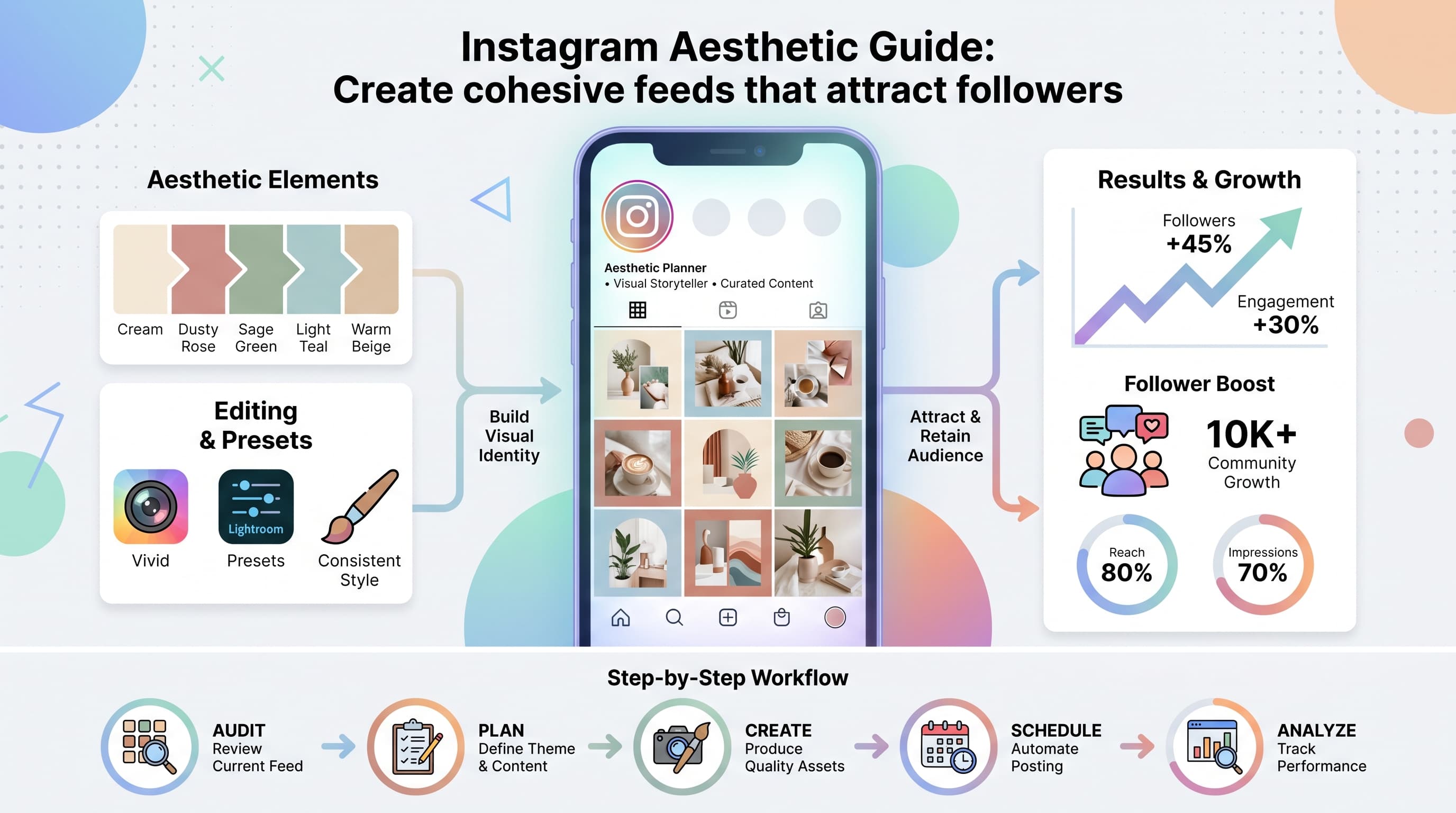
1. Audit your current feed
Look at your last 12-15 posts as if you're seeing them for the first time. What themes emerge? What colors appear most often? What content performs best? What feels disconnected or random?
Screenshot your grid and ask honest questions: Would you follow this account? What does this feed communicate about the brand? What feels professional and what feels amateur? Write down your observations to guide your improvements.
Identify your best-performing posts, both in terms of engagement and visual appeal. These posts give you clues about what resonates with your audience and what visual elements you should emphasize going forward.
2. Define your brand aesthetic goals
Write down specific goals for your Instagram aesthetic. Do you want to appear more professional? More approachable? More premium? More creative? These goals will guide every visual decision you make.
Consider your target audience's preferences and expectations. A B2B software company should probably avoid whimsical pastels. A children's brand might want to embrace playful colors. Your aesthetic should bridge what you want to communicate with what your audience wants to see.
Set measurable goals too. Maybe you want to increase profile visits by 50% or improve your follower conversion rate. A cohesive aesthetic should ultimately drive business results, not just look pretty.
3. Select your signature elements
Choose your 2-3 main colors, lighting style, and editing approach. Test these elements together by creating a few sample posts. Do they work well together? Do they support your brand goals? Can you consistently recreate this look?
Create a simple brand guide document with your color codes, editing settings, and style notes. This helps maintain consistency over time and makes it easier to create content or brief others who might help with your social media.
Consider practical constraints too. If you don't have access to great natural light, don't choose an aesthetic that depends on it. If you're not comfortable with heavy photo editing, choose a more natural approach. Your aesthetic should be sustainable for your situation.
4. Plan your content calendar
Map out 2-4 weeks of content using your new aesthetic guidelines. Include your content mix ratios, color palette, and posting schedule. Use a visual planning tool to see how posts will look together in your grid.
Batch create content when possible. If you're shooting product photos, photograph multiple products in the same session with consistent lighting and backgrounds. If you're creating graphics, design several at once using the same templates and colors.
Schedule your posts using a social media management tool. This ensures consistent posting frequency and gives you time to maintain quality standards. Rushed last-minute posts rarely fit well with a cohesive aesthetic strategy.
5. Create templates and systems
Develop templates for recurring content types. If you post quote graphics, create a template with your colors and fonts. If you share tips, develop a consistent format. Templates speed up content creation while maintaining visual consistency.
Build a library of brand assets: your color palette, fonts, logo variations, and graphic elements. Having these readily available makes it easier to maintain consistency and creates more professional-looking content.
Document your processes so you can maintain consistency even when you're busy or traveling. Write down your editing steps, content creation workflow, and posting schedule. Systems prevent your aesthetic from falling apart during hectic periods.
Common aesthetic mistakes to avoid
Even with good intentions, it's easy to make mistakes that undermine your aesthetic efforts. Here are the most common problems and how to avoid them.
Copying instead of adapting
Don't directly copy another account's aesthetic. It rarely works because their style is designed for their brand, audience, and goals. Instead, identify the principles they use and adapt those principles to your unique situation.
If you love someone's color palette, understand why it works for them before adopting it. Maybe those colors reflect their brand personality or appeal to their target demographic. Consider whether the same colors make sense for your brand story.
Prioritizing aesthetic over value
A beautiful feed that provides no value won't grow your business. Your aesthetic should enhance your content, not replace it. Focus on providing value first, then make that valuable content look cohesive and professional.
Sometimes the most valuable content doesn't fit perfectly with your aesthetic. In these cases, find creative ways to adapt it rather than skipping it entirely. Your audience follows you for the value you provide, not just pretty pictures.
Being too rigid
Consistency doesn't mean identical. Your posts should feel related but not monotonous. Allow for variety within your framework. If your palette is blues and whites, you can still post photos that are predominantly white or predominantly blue.
Leave room for timely content, trending topics, and spontaneous posts. Your aesthetic should be a guideline that improves your content, not a prison that limits your creativity or responsiveness.
Ignoring your audience preferences
Pay attention to which posts perform best and look for visual patterns. If your bright, colorful posts consistently outperform your muted ones, that's valuable data about your audience preferences.
Your aesthetic should evolve based on audience feedback and performance data. What you think looks good might not resonate with your followers. Be willing to adjust your approach based on what actually works.
Tools and resources for aesthetic success
The right tools make creating and maintaining a cohesive Instagram aesthetic much easier. Here are the most valuable resources for each aspect of the process.
Photo editing apps
VSCO offers professional-quality presets and advanced editing tools. The ability to save and apply custom presets makes maintaining consistency easier. Lightroom Mobile provides the most comprehensive editing capabilities, including selective adjustments and advanced color grading.
Snapseed is free and offers excellent control over colors, lighting, and effects. Canva works well for creating graphics, quote cards, and other designed elements that match your brand colors and fonts.
Content planning tools
Later and Planoly both offer visual grid previews so you can see how your posts will look together before publishing. Both include drag-and-drop scheduling and basic analytics.
Schedulala provides comprehensive social media scheduling with visual planning features, team collaboration tools, and advanced analytics to help you understand which aesthetic choices drive the best results for your specific audience.
Color and design resources
Adobe Color helps you create and test color palettes. You can explore trending color combinations or build custom palettes from uploaded images. Coolors.co offers a simple palette generator and lets you export colors in various formats.
Unsplash and Pexels provide high-quality stock photos that you can filter by color to find images that match your palette. Pinterest is excellent for aesthetic inspiration and mood board creation.
Analytics and optimization
Instagram Insights shows you which posts perform best, helping you identify successful aesthetic elements. Look at reach, engagement rates, and profile visits to understand what resonates.
Third-party analytics tools like Sprout Social or Hootsuite provide more detailed analysis of your visual content performance, including optimal posting times and content type comparisons.
Measuring your aesthetic success
A cohesive Instagram aesthetic should drive measurable improvements in your account performance. Here's what to track and how to interpret the results.
Key metrics to monitor
Profile visit rate measures how often people who see your content visit your profile. A cohesive aesthetic should increase this rate because your posts create intrigue about your overall brand.
Follower conversion rate tracks what percentage of profile visitors follow your account. A professional, cohesive feed should improve this metric significantly. Average engagement rate should also increase as your content becomes more recognizable and professional.
Track brand mention sentiment and direct message quality. A strong aesthetic often leads to more positive brand mentions and higher-quality inquiries from potential customers or collaborators.
Timeline for seeing results
Expect to see immediate improvements in profile visit conversion within the first week of implementing a cohesive aesthetic. People who land on your profile will be more likely to follow if your feed looks professional and intentional.
Recognition and engagement improvements typically take 2-4 weeks as your existing followers adjust to your new style and new followers discover your consistent content. Business impact like increased inquiries or sales usually develops over 1-3 months.
Adjusting based on performance
A/B test different aesthetic elements to optimize your approach. Try slightly different color combinations, editing styles, or content mixes to see what performs best with your specific audience.
Pay attention to individual post performance within your aesthetic. If certain types of posts consistently outperform others, increase their frequency. If some aesthetic choices seem to hurt engagement, adjust gradually.
Survey your audience occasionally to get direct feedback about your visual brand. Ask what they think of when they see your content and whether your aesthetic matches their perception of your brand.
Your aesthetic evolution strategy
Your Instagram aesthetic shouldn't be set in stone. The best accounts evolve their visual approach over time while maintaining core consistency. Here's how to grow and improve without losing what works.
Seasonal adjustments
Consider subtle seasonal variations within your core aesthetic. You might emphasize warmer colors in fall or add more bright whites in summer, while maintaining your fundamental color palette and style.
Seasonal content naturally changes, so your aesthetic should accommodate holidays, weather changes, and seasonal products or services without losing coherence. Plan these variations in advance rather than making sudden changes.
Growth-based evolution
As your account grows, you might need to refine your aesthetic to appeal to a broader audience or better reflect your expanding business. Document changes gradually and test audience response before making major shifts.
Growth often means more resources for content creation. You might upgrade from phone photography to professional photos, or add video content to your mix. Integrate these improvements smoothly rather than changing everything at once.
Platform changes adaptation
Instagram regularly updates its features and algorithms. Stay flexible enough to incorporate new content types like Reels, Stories highlights, or shopping features without abandoning your core aesthetic principles.
New features often favor early adopters, so being able to quickly adapt your aesthetic to new formats can provide competitive advantages. Think about how your colors, style, and brand personality translate to different content types.
Try Schedulala for free
Schedule posts to Bluesky, Twitter, and 8 other platforms from one dashboard.
Get started for free→Take action on your Instagram aesthetic today
Creating a cohesive Instagram aesthetic isn't about following trends or copying what everyone else is doing. It's about making intentional visual choices that support your brand goals and resonate with your ideal audience.
Start with the audit exercise. Look at your current feed honestly and identify the biggest opportunities for improvement. Choose one element to focus on first, whether that's color consistency, editing style, or content planning. Perfect that element before moving to the next.
Remember that consistency beats perfection every time. A consistently good aesthetic will always outperform randomly perfect posts. Your followers want to know what to expect from your brand, and your aesthetic is how you communicate that visually.