Pinterest Pin Design: Best Practices for Pins That Actually Get Clicked
Learn Pinterest pin design best practices: dimensions, text overlay, color, and layout tips that boost clicks, saves, and traffic in 2026.

Pinterest isn't a social network. It's a visual search engine that happens to have a feed, and that distinction changes everything about how you should design pins. Learn more about Instagram scheduling.
See It in Action
This is what scheduling an Instagram post looks like in Schedulala
Most brands treat Pinterest like Instagram: they repost the same square image with the same caption and wonder why nothing happens. Meanwhile, accounts that understand pin design are pulling in tens of thousands of monthly visitors from a single well-optimized pin, sometimes for years after they posted it. That's the part people miss. A great pin on Pinterest has a shelf life measured in months, not hours. See our scheduling across platforms guide.
This guide walks through exactly what makes a pin get saved, clicked, and re-shared, from the dimensions Pinterest actually favors to the text overlay tricks that stop the scroll. No fluff, no vague 'be creative' advice. Just the specifics that move the needle. Our batch content creation can help.
Try Schedulala for free
Schedule posts to Bluesky, Twitter, and 8 other platforms from one dashboard.
Get started for free→Why pin design matters more than posting frequency
On most platforms, showing up consistently is half the battle. Pinterest works differently. Its algorithm surfaces content based on relevance and quality signals over long time horizons, which means a poorly designed pin will get buried no matter how often you post it, while a genuinely well-made pin can keep generating clicks a year after it went live. See our pinterest content strategy what guide.
Think about how people actually use Pinterest. They're searching for something specific: a recipe, a workout plan, a home office setup, a wedding color palette. They're scanning a grid of images at speed, making split-second decisions about what deserves a tap. Your pin has maybe half a second to communicate what it is and why it's worth clicking. That's the whole game. Learn more about best time to post on instagram.
Good pin design isn't about looking pretty for its own sake. It's about clarity at a glance, legible text at thumbnail size, and a visual hook that separates your pin from the dozen similar-looking ones surrounding it in the feed. See our instagram image size guide guide.
The technical specs you actually need to know
Pinterest has been fairly consistent about its recommended dimensions, but a lot of content out there is outdated. Here's what works right now.
| Pin type | Recommended size | Aspect ratio | Notes |
|---|---|---|---|
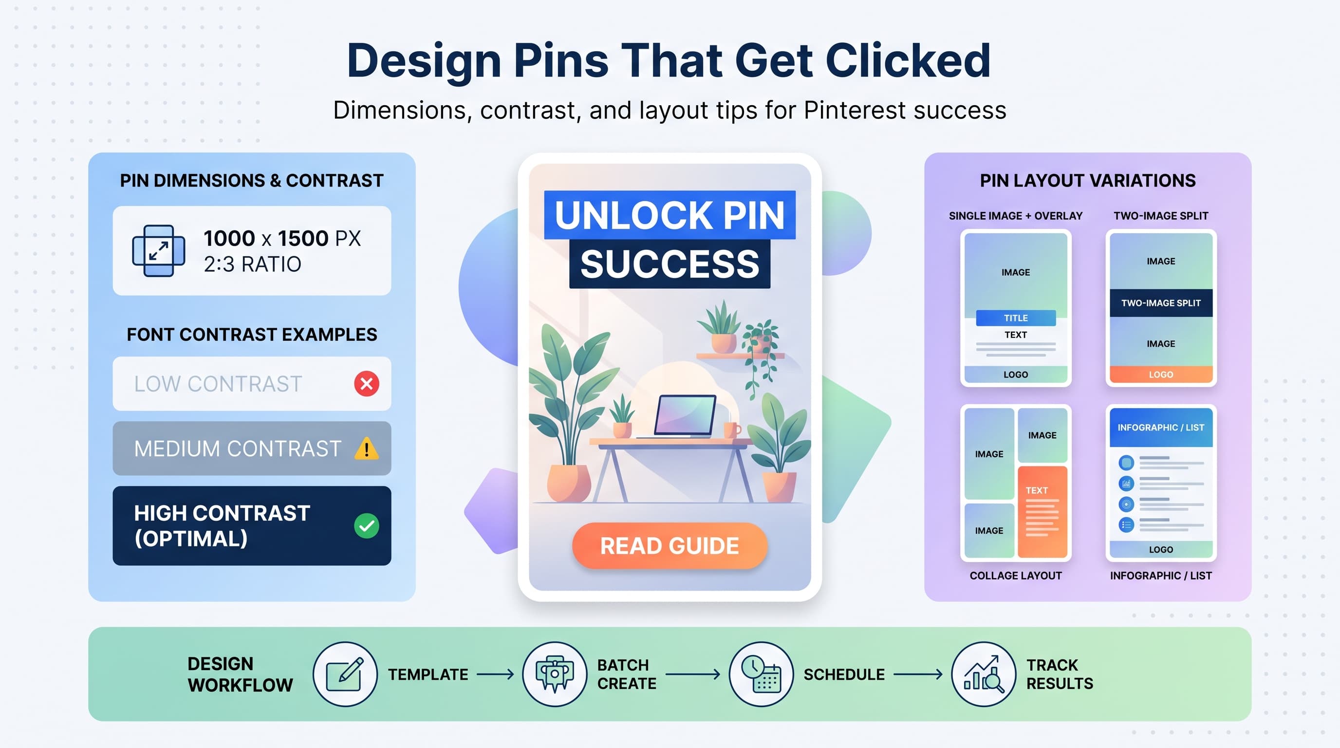
| Standard pin | 1000 x 1500 px | 2:3 | Pinterest's default and most-favored format |
| Square pin | 1000 x 1000 px | 1:1 | Fine for repurposing but ranks lower in reach |
| Long pin | 1000 x 2100 px | 1:2.1 | Max height before Pinterest crops it in feed |
| Idea pin (multi-page) | 1080 x 1920 px | 9:16 | Vertical, video-friendly, up to 20 pages |
| Video pin | 1080 x 1920 px | 9:16 | Also supports 1:1 and 4:5, but vertical performs best |
If you only remember one number, remember 2:3. Pinterest's own guidance consistently points to this ratio for standard pins, and it's the shape that gets the most real estate in a mobile feed without being cropped or squeezed. Anything much taller than 1000 x 2100 gets truncated, so don't bother designing a super-long infographic hoping people will scroll it in-feed. They'll only see the top portion until they click through.
The core design elements that drive clicks
1. Text overlay that answers a question
The single biggest lever for pin performance is text overlay. Pinterest users are searching for solutions, so a pin that says '15-minute vegan dinners for busy weeknights' will outperform a beautiful but wordless food photo almost every time. Treat your overlay text like a headline, not a caption.
Keep it to one clear line, or a headline plus a short subheadline. Avoid cramming five different value propositions onto one image. If you can't say it in under 10 words, split it into two pins.
2. High contrast, legible fonts
Pinterest thumbnails render small on mobile, often under 300 pixels wide in-feed. Thin, decorative script fonts that look gorgeous full-size become an unreadable smudge at that scale. Stick to bold, sans-serif fonts for your primary overlay text, and reserve script or serif fonts for small accents only.
Contrast matters as much as font weight. White text on a busy photo background disappears. Add a solid color block, a subtle gradient overlay, or a semi-transparent panel behind your text so it stays legible regardless of what's happening in the photo underneath.
3. A clear focal point
Every high-performing pin has one obvious thing to look at, whether that's a hero product shot, a single striking photo, or a bold headline treatment. Pins that try to show six different angles or five different products in one collage tend to underperform because the eye doesn't know where to land.
If you're promoting a blog post with multiple tips, don't try to visualize all seven tips in one image. Pick the most compelling one, or use a simple numbered list graphic that reads clearly at a glance.
4. Consistent, recognizable branding
A small logo or watermark in a corner, paired with a consistent color palette and font pairing across your pins, builds recognition over time. Users start to recognize your pins in the feed before they even read the text, which increases click-through rate on repeat exposure.
Don't overdo the branding though. A logo that takes up 15% of the image is a distraction, not a trust signal. Small and consistent beats large and loud.
5. Color choices that stop the scroll
Pinterest feeds skew toward soft neutrals, pastels, and warm tones in categories like home decor, weddings, and lifestyle content. That means a genuinely bold or unexpected color choice, done well, can stand out precisely because it breaks the visual pattern of the feed around it.
Test a few different color families for the same pin design. We've seen creators run the identical layout in three color variants and get wildly different save rates purely based on which one popped against the surrounding content in that niche.
Standard pins vs. idea pins vs. video pins
Not every pin type deserves the same design approach, and Pinterest treats them differently in distribution too.
Standard static pins remain the workhorse of most Pinterest strategies. They're cheap to produce, they link directly to a destination URL, and they compound over time as evergreen traffic drivers. This is where the fundamentals above (contrast, focal point, headline text) matter most.
Idea pins are Pinterest's multi-page, story-style format, and they currently get favorable placement in the algorithm because Pinterest wants to promote a format that keeps users inside the app. Design-wise, idea pins should feel like a mini tutorial: a cover page with a strong hook, followed by 4 to 10 pages that walk through steps, tips, or a before-and-after. Use consistent fonts and colors across every page so it reads as one cohesive piece rather than a slideshow of mismatched slides.
Video pins are worth the extra production effort for anything demonstrable: recipes, DIY projects, product demos, styling tutorials. Keep the first three seconds visually arresting since that's the window before someone scrolls past. Add captions directly into the video since a large share of Pinterest users browse with sound off.
| Format | Best for | Design priority |
|---|---|---|
| Standard pin | Blog posts, product pages, evergreen traffic | Headline clarity, contrast |
| Idea pin | Tutorials, tips, behind-the-scenes | Cohesive page-to-page branding |
| Video pin | Recipes, demos, transformations | Strong first 3 seconds, on-screen captions |
Writing copy that pairs with the image
Pin design isn't only the visual. The title and description you attach to a pin function as search metadata, and Pinterest's algorithm leans on them heavily to decide who sees your content.
Write your pin title the way you'd write a search query someone might type. Instead of 'My kitchen', write 'Small kitchen storage ideas for renters'. Keep titles under 100 characters and front-load the keyword you want to rank for.
The description gets a bit more room, roughly 500 characters, and this is where you can naturally include related keywords, a light call to action, and context that helps Pinterest categorize the pin correctly. Avoid keyword-stuffing though. Write it like a helpful sentence a human would read, not a list of search terms jammed together.
Common pin design mistakes to avoid
- Reusing Instagram square images without cropping. A 1080x1080 square looks small and boxed-in inside a 2:3 feed layout. Always design a native vertical version.
- Using stock photos that look like stock photos. Pinterest users are savvy at spotting generic imagery, and it tends to underperform against real, lived-in photography or custom graphics.
- Overloading one pin with too much text. If your headline needs three lines to finish a thought, split it into a headline plus a smaller subhead, or cut the message down.
- Ignoring vertical space. A lot of designers center everything in a square in the middle of a 2:3 canvas, wasting the top and bottom thirds. Use the whole canvas intentionally.
- Skipping alt text and keyword-rich titles. Design is only half the equation. A gorgeous pin with a vague title like 'Photo 4' won't surface in search no matter how good it looks.
- Publishing one pin per post and moving on. High performers create 3 to 5 pin variations per piece of content, testing different headlines, colors, and layouts to see what the audience responds to.
Building a repeatable pin design system
The creators and brands who win on Pinterest long-term aren't designing every pin from scratch. They build a small library of templates in tools like Canva or Figma with locked brand colors, font pairings, and layout structures, then swap in new photos and headlines for each piece of content.
A practical system looks like this: 3 to 5 core layout templates (a photo-plus-headline layout, a numbered list layout, a before-and-after layout, and a quote or stat callout layout), each available in your 2 to 3 brand color variants. That gives you 9 to 15 combinations to rotate through without ever looking repetitive, while still keeping production time low.
Once you have a system, batching becomes realistic. Set aside two hours once a month, produce 20 to 30 pins across your active content, and load them into a scheduler so they go out at a steady pace instead of in one exhausting burst. Pinterest specifically rewards accounts that post consistently over weeks and months rather than dumping 40 pins in a single day and going quiet for six weeks.
Scheduling pins without losing momentum
Design is only useful if the pins actually go out on a schedule, and manually uploading pins one at a time in the Pinterest app is where most people's consistency falls apart. This is where a scheduling tool earns its keep.
Schedulala supports Pinterest along with 11 other platforms (Instagram, TikTok, Twitter/X, LinkedIn, YouTube, Facebook, Threads, Bluesky, Telegram, Mastodon, and Google Business Profile), so you can queue up a month of pins in one sitting and let them publish at the times your audience is most active, without opening the app again until it's time to check results.
Every Schedulala plan includes unlimited scheduled posts, even on the entry-level Personal plan at $29 a month for 10 social accounts. Those 10 accounts aren't locked to specific platforms either. If your strategy is Pinterest-heavy, you could run 6 Pinterest boards' worth of accounts and 4 other channels, or split it however your actual content mix demands. There's no per-platform sub-limit forcing you into a rigid bundle.
For teams managing multiple client accounts or a bigger brand portfolio, the Team plan runs $49 a month for 25 accounts, and Agency runs $99 a month for 100 accounts, both with the same unlimited posting and flat account-count structure. Pay annually and you get 2 months free on any plan (Personal at $290/year, Team at $490/year, Agency at $990/year). There's a 7-day free trial to test the workflow before committing, though a card is required to start it.
A quick pre-publish checklist
- Canvas is 1000 x 1500 pixels (2:3 ratio) unless you have a specific reason to deviate
- Headline text is legible at thumbnail size and answers a real search intent
- There's one clear focal point, not five competing elements
- Contrast between text and background holds up even on the busiest part of the image
- Branding (logo, colors, fonts) is small, consistent, and matches your other pins
- Title and description include the actual keyword someone would search, written naturally
- You have at least 2 to 3 pin variations for this piece of content, not just one
- The pin is scheduled at a time that spreads out your posting instead of batching it all into one day
The bottom line on pin design
Pinterest rewards clarity over cleverness. A bold headline, a single focal point, high contrast, and consistent branding will outperform an over-designed, cluttered pin nearly every time. Build a small template system, write titles like search queries, and produce multiple variations per piece of content instead of hoping one pin does all the work.
Then get consistent about publishing. The best-designed pin in the world does nothing sitting in a folder on your desktop. Design in batches, schedule ahead, and let the compounding nature of Pinterest do what it does best: keep sending traffic to content you made months ago.
Try Schedulala for free
Schedule posts to Bluesky, Twitter, and 8 other platforms from one dashboard.
Get started for free→