Social Media Image Sizes: The Complete 2026 Cheat Sheet for Every Platform
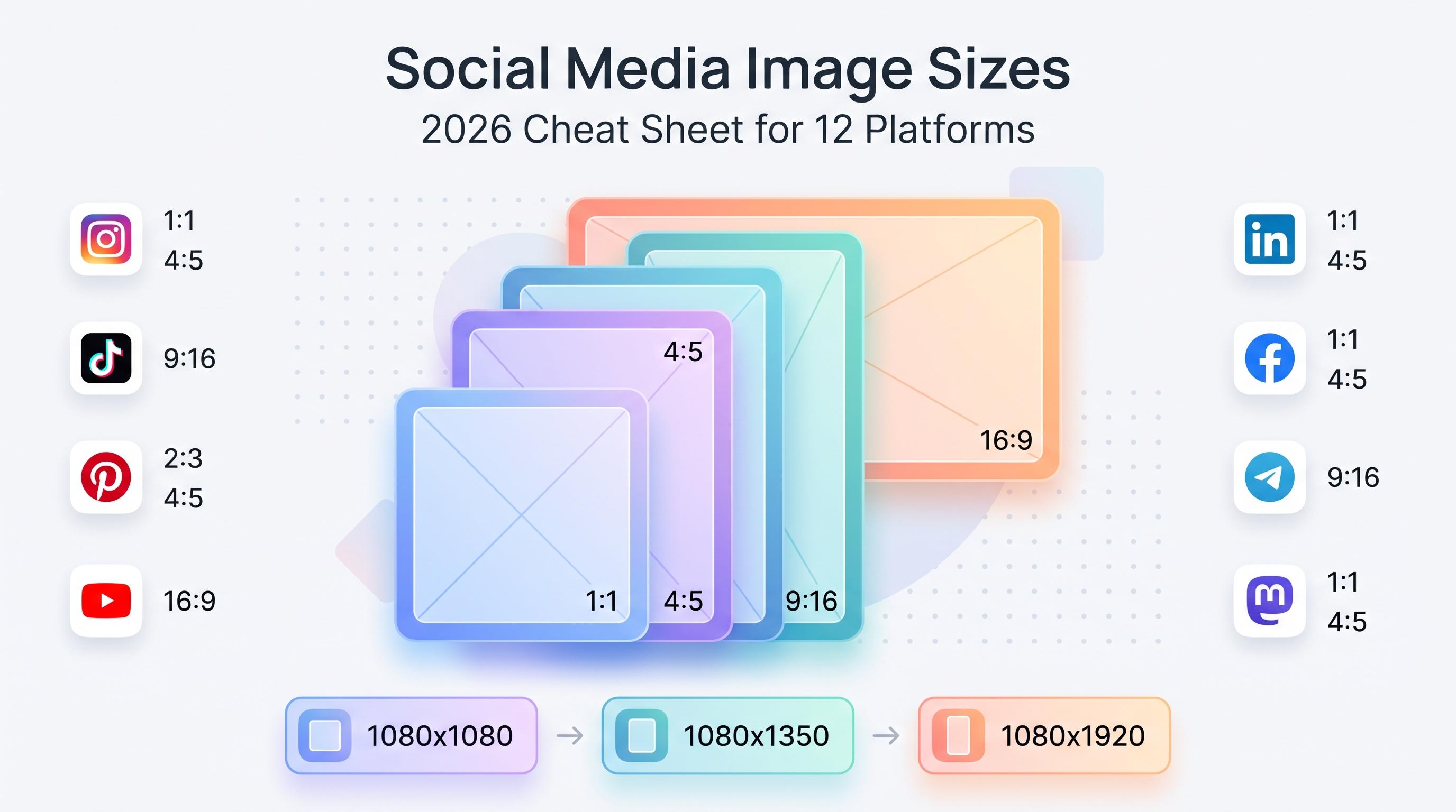
The 2026 cheat sheet for social media image sizes across 12 platforms, with exact dimensions, ratios, and tips to stop your posts from getting cropped.

You spend twenty minutes designing a graphic, upload it everywhere, and half your platforms crop your subject's face out. Sound familiar? Social media image sizes change often enough, and differ enough between platforms, that even people who post for a living keep a cheat sheet taped to their monitor. See our Instagram scheduling guide.
See It in Action
This is what scheduling an Instagram post looks like in Schedulala
This is that cheat sheet. Every dimension below reflects what each platform actually displays in 2026, not what some outdated blog post from 2019 told you. Bookmark this page, or better yet, build your templates once using these numbers and never think about it again. Learn more about content calendar.
Try Schedulala for free
Schedule posts to Bluesky, Twitter, and 8 other platforms from one dashboard.
Get started for free→Why image size still trips people up in 2026
Every platform renders images in a different container. Instagram wants a near-square. Pinterest wants something tall. LinkedIn used to stretch everything into a wide banner shape but now crops aggressively on mobile. If you design one image and blast it to all 12 platforms without adjusting, you're guaranteed to lose important content to a crop, a watermark overlay, or awkward letterboxing. See our content calendar guide.
The fix isn't complicated. You just need the right numbers and a habit of designing for the smallest safe area first, then expanding outward. That's what the rest of this guide gives you: exact pixel dimensions, aspect ratios, and the file-size limits that actually matter for quality. Our social media content buckets can help.
Instagram image sizes
Instagram remains the platform where getting the size wrong is most noticeable, mostly because the app crops thumbnails on your grid differently than it displays the full post. Here's what to use for each format. Try our best time to post on instagram.
| Format | Recommended size | Aspect ratio |
|---|---|---|
| Square feed post | 1080 x 1080 px | 1:1 |
| Portrait feed post | 1080 x 1350 px | 4:5 |
| Landscape feed post | 1080 x 566 px | 1.91:1 |
| Stories / Reels | 1080 x 1920 px | 9:16 |
| Profile picture | 320 x 320 px (displays as circle) | 1:1 |
| Carousel slides | 1080 x 1350 px | 4:5 |
If you want my honest opinion: default to 4:5 portrait for feed posts. It takes up more vertical real estate in the scroll, which means more screen time per impression, and Instagram hasn't punished portrait content the way some creators feared it would. Square is fine but you're leaving free visibility on the table. Our instagram image size guide can help.
TikTok and Threads image sizes
TikTok is a video-first app, but photo mode posts (and video cover images) still need the right dimensions. Threads, meanwhile, inherited a lot of its image handling directly from Instagram's engine, so the numbers will look familiar.
| Platform | Format | Recommended size | Aspect ratio |
|---|---|---|---|
| TikTok | Video / photo post | 1080 x 1920 px | 9:16 |
| TikTok | Profile picture | 200 x 200 px | 1:1 |
| Threads | Single image post | 1080 x 1350 px | 4:5 |
| Threads | Square image | 1080 x 1080 px | 1:1 |
| Threads | Profile picture | 320 x 320 px | 1:1 |
On TikTok, anything not shot in 9:16 gets pillarboxed with blurred bars on either side. It still works, but it screams 'repurposed content' to anyone scrolling fast. If TikTok is a priority channel, design natively in 9:16 rather than cropping a square Instagram post down.
Twitter/X and Bluesky image sizes
X still favors a wide landscape shape in the timeline, even though more people are browsing on phones than ever. Bluesky, the newer kid on this list, follows a similar in-feed display pattern but is more forgiving of near-square crops.
| Platform | Format | Recommended size | Aspect ratio |
|---|---|---|---|
| Twitter/X | In-stream image | 1600 x 900 px | 16:9 |
| Twitter/X | Profile picture | 400 x 400 px | 1:1 |
| Twitter/X | Header image | 1500 x 500 px | 3:1 |
| Bluesky | In-feed image | 1200 x 1200 px (or 1200 x 628) | 1:1 or 1.91:1 |
| Bluesky | Profile picture | 400 x 400 px | 1:1 |
| Bluesky | Banner image | 1500 x 500 px | 3:1 |
X compresses images hard. If you're posting a chart, infographic, or anything with small text, export at the full 1600x900 and use PNG rather than JPEG. You'll lose less detail to compression artifacts.
LinkedIn image sizes
LinkedIn's feed has gotten noticeably more mobile-first, which means the old 'wide banner' sizes get cropped on phones more than people realize. Use these and double-check the mobile preview before publishing.
| Format | Recommended size | Aspect ratio |
|---|---|---|
| Single image post | 1200 x 627 px | 1.91:1 |
| Square post | 1200 x 1200 px | 1:1 |
| Personal profile picture | 400 x 400 px | 1:1 |
| Personal cover photo | 1584 x 396 px | 4:1 |
| Company page logo | 300 x 300 px | 1:1 |
| Company page banner | 1128 x 191 px | 5.9:1 |
YouTube image sizes
Thumbnails are arguably the single highest-leverage image you'll create on any platform. A great thumbnail at the wrong size gets Google-compressed into mush. Get these exact.
| Format | Recommended size | Aspect ratio |
|---|---|---|
| Video thumbnail | 1280 x 720 px | 16:9 |
| Channel banner (full canvas) | 2560 x 1440 px | 16:9 |
| Channel banner (safe text area) | 1546 x 423 px | center-safe zone |
| Channel profile picture | 800 x 800 px | 1:1 |
| Shorts cover / video | 1080 x 1920 px | 9:16 |
That 'safe text area' number matters more than people think. The full 2560x1440 banner gets cropped differently on TV, desktop, and mobile. Anything you want readable on every device has to sit inside the 1546x423 center zone, or your channel name and tagline will get chopped off on someone's phone.
Facebook image sizes
Facebook's feed algorithm and display engine have been stable for a while, which is a relief after years of constant resizing chaos. These sizes have held steady and should work well into 2026.
| Format | Recommended size | Aspect ratio |
|---|---|---|
| Shared image post | 1200 x 630 px | 1.91:1 |
| Square post | 1200 x 1200 px | 1:1 |
| Stories | 1080 x 1920 px | 9:16 |
| Profile picture | 170 x 170 px (displays smaller on mobile) | 1:1 |
| Cover photo | 820 x 312 px (desktop) / 640 x 360 px (mobile) | varies |
| Event cover image | 1920 x 1005 px | 1.91:1 |
Facebook cover photos are the one spot where desktop and mobile genuinely display different crops. If your cover photo has text or a logo near the edges, it's getting cut off for a chunk of your audience. Keep the important stuff centered.
Pinterest image sizes
Pinterest is the odd one out on this list because it's the only platform actively rewarding tall, vertical images in the feed. Design short and square here and you're fighting the platform's own layout logic.
| Format | Recommended size | Aspect ratio |
|---|---|---|
| Standard pin | 1000 x 1500 px | 2:3 |
| Idea pin (multi-page) | 1080 x 1920 px | 9:16 |
| Profile picture | 165 x 165 px | 1:1 |
| Board cover | 600 x 600 px | 1:1 |
Telegram, Mastodon, and Google Business Profile image sizes
These three get skipped in most 'social media size' roundups, which is exactly why Schedulala readers ask about them constantly. All three are increasingly part of a real multi-platform strategy, especially Mastodon for brands building owned audiences off the big platforms, and Google Business Profile for local businesses relying on search visibility.
| Platform | Format | Recommended size | Aspect ratio |
|---|---|---|---|
| Telegram | Channel post image | 1280 x 1280 px max display width | flexible, 1:1 or 4:5 safest |
| Telegram | Profile / channel photo | 512 x 512 px | 1:1 |
| Mastodon | Timeline image | 1280 x 1280 px | flexible, 16:9 displays cleanest |
| Mastodon | Profile picture | 400 x 400 px | 1:1 |
| Mastodon | Header/banner | 1500 x 500 px | 3:1 |
| Google Business Profile | Cover photo | 1024 x 576 px | 16:9 |
| Google Business Profile | Logo | 720 x 720 px | 1:1 |
| Google Business Profile | Additional photos | 720 x 720 px minimum | 1:1 or 4:3 |
Google Business Profile deserves a special callout because it's not really a 'social' platform in the traditional sense, but it absolutely counts as a channel you need to post to regularly if local search matters to your business. Photos that are too small or badly lit get buried below competitor listings, even if your actual business is better.
The universal safe sizes, if you only remember three numbers
If you've made it this far and your eyes are glazing over from all the tables, here's the cheat behind the cheat sheet. These three ratios cover the vast majority of platforms with minimal cropping risk:
- 1080 x 1080 (1:1): works on Instagram, Threads, Facebook, Bluesky, LinkedIn, Telegram, and Mastodon without major cropping.
- 1080 x 1350 (4:5): the best-performing shape for Instagram, Threads, and LinkedIn document carousels.
- 1080 x 1920 (9:16): required for Stories, Reels, TikTok, Shorts, and Pinterest Idea Pins.
Design your master file at 1080x1350, keep your key subject and text inside the center 1080x1080 zone, and you'll survive being cropped on almost every platform on this list without a redesign.
Common mistakes people make with social image sizing
1. Uploading the same file everywhere
This is the single biggest offender. A 1080x1080 square looks fine on Instagram and gets awkward gray bars on Pinterest, or gets cropped down to an unrecognizable sliver on a LinkedIn banner. Resize per platform, every time.
2. Ignoring platform-specific text zones
Instagram's grid preview crops portrait images to a square. YouTube's banner has a 'safe area' that's a fraction of the total canvas. If your logo or headline sits near the edge, assume it's getting cut off for someone.
3. Over-compressing files
People get so focused on the right pixel dimensions that they forget file size and compression. A 1280x720 YouTube thumbnail saved as a heavily compressed JPEG looks noticeably worse than the exact same image saved at a reasonable quality setting. Aim for under 5MB without crushing the quality below 80%.
4. Designing for desktop previews only
Over 90% of social traffic across most platforms is mobile. If you're only checking how an image looks in a desktop design tool, you're not actually checking how your audience will see it. Preview everything on an actual phone before you schedule it.
How to stop resizing images manually every single time
Here's the honest truth: knowing the right sizes is only half the battle. The other half is not having to manually export twelve versions of the same graphic every time you post. This is where most people's workflow quietly falls apart, usually around week three of a new content calendar.
A few things that genuinely save time once you build the habit: keep a master template at 1080x1350 in whatever design tool you use, export square and 9:16 crops as presets rather than manually dragging corners each time, and schedule posts from a tool that shows you a real preview per platform before it goes live, not just a generic thumbnail.
Schedulala's post composer shows platform-specific previews as you build a post, so you can catch a bad crop before it's live instead of finding out from a confused comment three hours later. It supports all 12 platforms covered in this guide (Instagram, TikTok, Twitter/X, LinkedIn, YouTube, Facebook, Threads, Bluesky, Pinterest, Telegram, Mastodon, and Google Business Profile), and every plan includes unlimited scheduled posts, so you're never stuck choosing which image gets queued and which one waits.
Try Schedulala for free
Schedule posts to Bluesky, Twitter, and 8 other platforms from one dashboard.
Get started for free→A quick workflow for getting sizing right every time
If you want a repeatable system instead of re-reading this guide every month, here's a simple five-step process that works whether you're a solo creator or running a small agency account.
- Design your master file at 1080x1350. This is the most flexible starting ratio and crops cleanly to square if needed.
- Keep faces, logos, and text inside the center 1080x1080 safe zone. This protects you from grid crops and aspect ratio changes.
- Export platform-specific versions using the tables above, rather than relying on the platform to auto-crop for you.
- Preview on mobile before publishing. Most platforms render differently on phones than in a browser-based editor.
- Save your export presets so this becomes a five-minute task instead of a thirty-minute one every single time.
Do this once for your brand templates and you'll never have to think about it again except when a platform rolls out a redesign, which happens less often than you'd think given how much people complain about it.
The bottom line
Social image sizing isn't glamorous work, but it's the kind of detail that separates posts that look intentional from posts that look like an afterthought. Spend the twenty minutes building your templates correctly once, and you'll save yourself hours of 'why does my thumbnail look cut off' troubleshooting for the rest of the year.
Try Schedulala for free
Schedule posts to Bluesky, Twitter, and 8 other platforms from one dashboard.
Get started for free→